


Document Actions
gvSIG Mobile 0.3. User guide
Personal forms are used to view, edit and insert alphanumeric data, exactly as with a generic form, the difference being that the appearance of the various components is defined by the user. A personal form can display data in tabular format, define ranges of integers to be met by the values contained in the fields, or even display icons alongside labels.
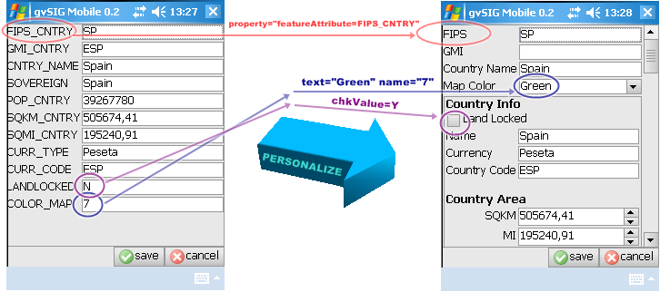
Customizing a generic gvSIG Mobile form for use with a particular layer
Personal forms in gvSIG Mobile are based on Thinlet
- Thinlet is a User Interface tool that takes up very little space. It is a Java class, which interprets an XML file to display information on screen, handle user input, and perform basic associated operations. It separates the graphical display (defined in an XML file) from the methods of the application (which are written in Java).
gvSIG Mobile already has generic application methods that interpret forms, execute the most common field operations, and present data in an appropriate manner.
Creating a form step-by-step
Step 1: Create a new XML file
Use a text editor to create a new text file with an extension of XML, for example "form.xml".
Step 2: Select the components to appear on the form
Decide which components are needed to represent the desired attributes. The types of components that are available are as follows:
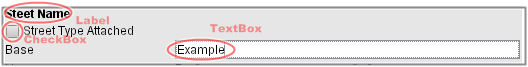
A label followed by a checkbox and a text field
Text field A text box to enter data associated with an attribute of a feature.
<textfield property="featureAttribute=attribute_name"/>
Password field A text box that hides the text entered by the user.
<passwordfield text="secret value"/>
Text area A box in which to enter several lines of data associated with an attribute.
<textarea text="TextArea" wrap="true" columns="40" rows="2" property="featureAttribute=attribute_name"/>
Text label A label used to name an attribute, or to display information on the form.
<label text="Label" icon="image.gif" alignment="center" />
Checkbox A selection box associated with an attribute that allows only two values, namely selected or not selected.
<checkbox text="CheckBox" icon="image.gif" selected="true"/>
<checkbox text="RadioButton-on" group="group" selected="true"/>
<checkbox text="RadioButton" group="group"/>
Combo box A component that displays a drop-down list of values. Values can be selected from the list or a new value can be entered in the text box part of the combo box.
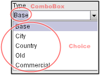
A combo box showing a drop-down list of values that can be selected
<combobox colspan="1" property="featureAttribute=OPTION">
      <choice text="Option 1" name="CODE1"/>
      <choice text="Option 2" name="CODE2"/>
      ...
      <choice text="Disabled" enabled="false" />
</combobox>
Numeric ranges A box in which to enter number within a particular range. The box has buttons to increase and decrease the number.
<spinbox text="0" minimum="0" maximum="120" property="featureAttribute=SPEED_LIMIT">
Step 3: Design the layout and grouping of the attributes
If attributes of a feature need to be grouped, or if grouping is needed to structure the form then the following components can be used:
Table A table is used to display several attributes that can have multiple values. n x m (n samples of m values).
<table colspan="3" selection="multiple">
<header>
    <column text="Attribute"/>
    <column text="L"/>
    <column text="R"/>
</header>
<row selected="true">
    <cell name="AreaId" text="AreaId" enabled="false"/>
    <cell property="featureAttribute=L_AREA_ID" enabled="true"/>
    <cell property="featureAttribute=R_AREA_ID" enabled="true"/>
</row>
<row>
    <cell name="Postcode" text="Postcode" enabled="false"/>
    <cell property="featureAttribute=L_POSTCODE"/>
    <cell property="featureAttribute=R_POSTCODE"/>
</row>
<row>
    <cell name="NumZones" text="NumZones" enabled="false"/>
    <cell property="featureAttribute=L_NUMZONES"/>
    <cell property="featureAttribute=R_NUMZONES"/>
</row>
</table>
Tree Attributes are displayed in hierarchical form using a tree structure.
<tree colspan="3" selection="multiple">
    <node name="AreaId" text="AreaId">
         <node text="L">
             <node property="featureAttribute=L_AREA_ID" selected="true" />
         </node>
         <node text="R">
             <node property="featureAttribute=R_AREA_ID" selected="true" />
         </node>
    </node>
    <node name="Postcode" text="Postcode">
         <node text="L">
              <node property="featureAttribute=L_POSTCODE" selected="true" />
         </node>
         <node text="R">
              <node property="featureAttribute=R_POSTCODE" selected="true" />
         </node>
    </node>
    <node name="NumZones" text="NumZones">
         <node text="L">
              <node property="featureAttribute=L_NUMZONES" selected="true" />
         </node>
         <node text="R">
              <node property="featureAttribute=R_NUMZONES" selected="true" />
         </node>
    </node>
</tree>
Tab Tabs can be used to group attributes, which can be displayed using any of the component types described above.
<tabbedpane placement="left" selected="1" action="tabchanged">
    <tab text="One">
         ....
         Components
         ....
    </tab>
    <tab text="Two" alignment="right">
         ....
         Components
         ....
    </tab>
</tabbedpane>
Panel Groups of related attributes can be displayed on separate panels. A panel can contain any of the component types described above.
<panel columns="3" gap="4" top="4" left="4" bottom="4" right="4">
          ....
          Components
          ....
</panel>
Step 4: Write the XML file
Once the components have been selected and the layout has been designed, the XML code can be written. The table below lists the general attributes of components that can be included on a form.
Component Attributes
A list of some of the properties common to all the most frequently used components.
| PROPERTY | TYPE | FUNCTION |
|---|---|---|
| name | string | Identifies the component so that it can be referenced by other components. |
| visible | boolean | If set to "false" the component does not appear. |
| font | font | Define the text font. |
| foreground | color | Define the text colour. |
| background | color | Define the background colour of the component. |
| width | integer | Width of the component. If set to zero the width is set according to the value of the attribute. |
| height | integer | Height of the component. If set to zero the height is set according to the value of the attribute. |
| colspan | integer | Indicates the number of columns that the component occupies on the display (default 1). |
| rowspan | integer | Indicates the number of rows the component occupies on the display (default 1). |
| weightx | integer | Determines the horizontal cell distribution when space is available on the form. |
| weighty | integer | Determines the vertical cell distribution when space is available on the form. |
| halign | choice | Horizontal alignment of cell contents. Possible values are: left right center fill. |
| valign | choice | Vertical alignment of cell contents. Possible values are: left right center fill. |
| property | property | Binds a property key / value to the component. To associate the attribute value of a feature to aproperty="featureAttribute=attribute_name". |
Example of a personal form
Taking the size of the Mobile Devices's screen into account, the following form has been designed to show a number of components. The screen contains a number of Thinlet components including a panel with components arranged in columns.
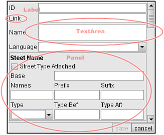
An example of a form with a panel and several Thinlet elements
<?xml version="1.0" encoding="ISO-8859-1"?>
<!-- generated by ThinG, the Thinlet GUI editor -->

<panel top="2" left="2" bottom="2" right="2" columns="2" gap="2" height="1350" width="220" weightx="1">

    <label colspan="1" text="ID"/>
    <textfield colspan="1" property="featureAttribute=FEAT_ID" weightx="1"/>

    <label colspan="1" text="Link"/>
    <textfield colspan="1" property="featureAttribute=LINK_ID"/>

    <label colspan="1" text="Name"/>
    <textarea colspan="1" wrap="true" rows="1" property="featureAttribute=ST_NAME"/>

    <label colspan="1" text="Language"/>
    <combobox colspan="1" property="featureAttribute=ST_LANGCD">
        <choice text="Basque" name="BAQ"/>
        <choice text="Catalan" name="CAT"/>
        <choice text="Croatian" name="SCR"/>
        <choice text="Czech" name="CZE"/>
        <choice text="Danish" name="DAN"/>
        <choice text="Dutch" name="DUT"/>
        <choice text="English" name="ENG"/>
        <choice text="Estonian" name="EST"/>
        <choice text="Finnish" name="FIN"/>
        <choice text="French" name="FRE"/>
        <choice text="Gaelic" name="GAE"/>
        <choice text="Galician" name="GAG"/>
        <choice text="German" name="GER"/>
        <choice text="Greek (Modern)" name="GRT"/>
        <choice text="Hungarian" name="HUN"/>
        <choice text="Italian" name="ITA"/>
        <choice text="Latvian" name="LAT"/>
        <choice text="Lithuanian" name="LIT"/>
        <choice text="Norwegian" name="NOR"/>
        <choice text="Polish" name="POL"/>
        <choice text="Portuguese" name="POR"/>
        <choice text="Slovak" name="SLO"/>
        <choice text="Slovenian" name="SLV"/>
        <choice text="Spanish" name="SPA"/>
        <choice text="Swedish" name="SWE"/>
        <choice text="Welsh" name="WEL"/>
    </combobox>

    <panel top="2" left="2" bottom="2" right="2" colspan="2" columns="3" gap="2" border="true">
    <label colspan="3" text="Steet Name" font="bold"/>

    <checkbox colspan="3" text="Street Type Attached" property="featureAttribute=ST_TYP_ATT;chkValue=Y"/>

    <label colspan="1" text="Base"/>
    <textfield colspan="2" property="featureAttribute=ST_NM_BASE"/>

    <label text="Names"/>
    <label text="Prefix"/>
    <label text="Sufix"/>

    <textfield colspan="1" property="featureAttribute=NUM_STNMES" width="30" height="20" weightx="1"/>
    <textfield colspan="1" property="featureAttribute=ST_NM_PREF" width="30" height="20" weightx="1"/>
    <textfield colspan="1" property="featureAttribute=ST_NM_SUFF" width="30" height="20" weightx="1"/>


    <label text="Type"/>
    <label text="Type Bef"/>
    <label text="Type Aft"/>

    <combobox colspan="1" property="featureAttribute=ADDR_TYPE" width="30" height="20">
         <choice text="Base" name="B"/>
         <choice text="City" name="C"/>
         <choice text="Country" name="D"/>
         <choice text="Old" name="O"/>
         <choice text="Commercial" name="T"/>
    </combobox>

    <textfield colspan="1" property="featureAttribute=ST_TYP_BEF" width="30" height="20"/>
    <textfield colspan="1" property="featureAttribute=ST_TYP_AFT" width="30" height="20"/>

    </panel>

</panel>


